Summary
Contents
This was an Azure project from the beginning, which made it fun. I was also able to use SignalR to provide immediate feedback to the user as the file was being analyzed. I use Redis on the server to store the results for the last 7 days. Purging old results is automatic, since Redis can expire a key after a set number of days.
The site uses FluentValidation for the many rules to check the file. This tool made some pretty complex validation much easier. It also helped eliminate what would have been a bunch of repetitious code.
Screens
Main Screen
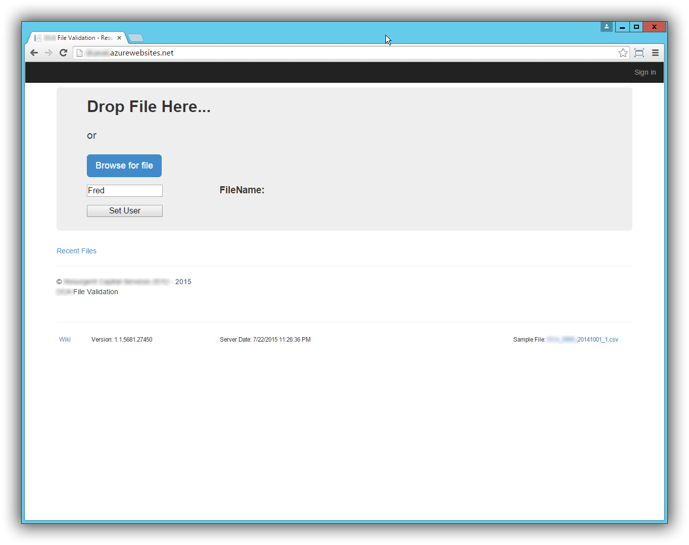
When the user loads the site, this is the first screen they see. They can either drop a file on this page or click the browse button for a file picker dialog.
The User textbox and associated button was a temporary way of grouping SignalR messages. The name really should have been changed to Group instead of user. The idea is that everybody listening in Group “Fred” would receive the same messages. This is important because of the next screen.
Receiving File Screen
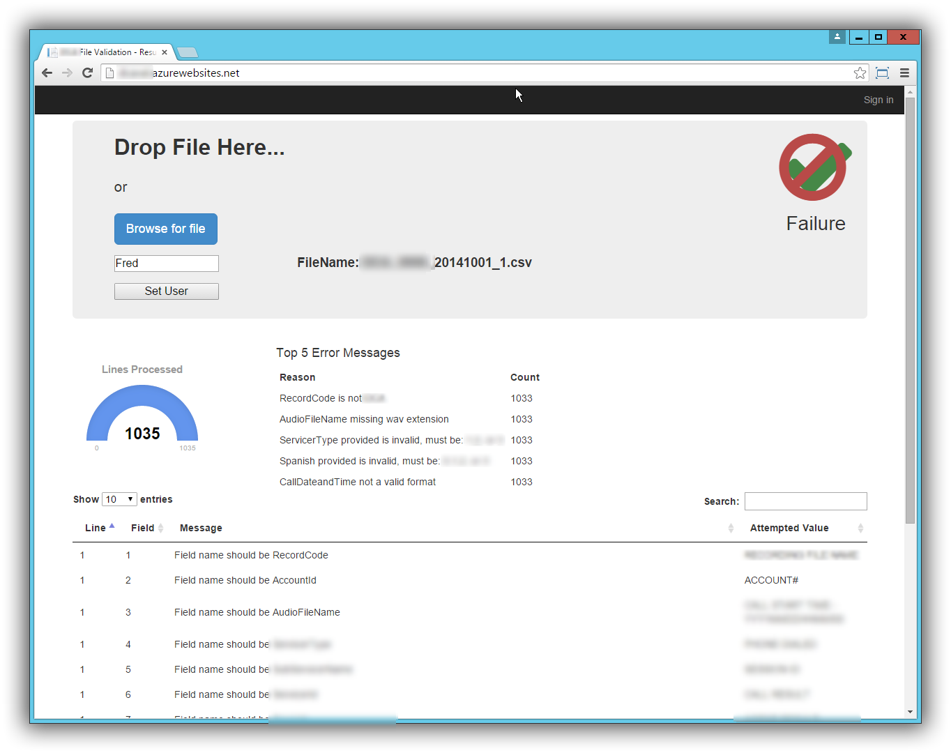
As the file is being analyzed, results are being sent back to the browser. The top 5 errors encountered are entered in the green list (not sure why I made it green). The gauge animates to show the number of lines processed.

Upload Complete Screen
When the analysis is complete, the user will either see a green check mark indicating the file is good, or they will see the green check mark with the red “not” circle indicating there were problems. A DataTables grid appears at the bottom of the page where they can view all the errors (using paging).
History List Screen
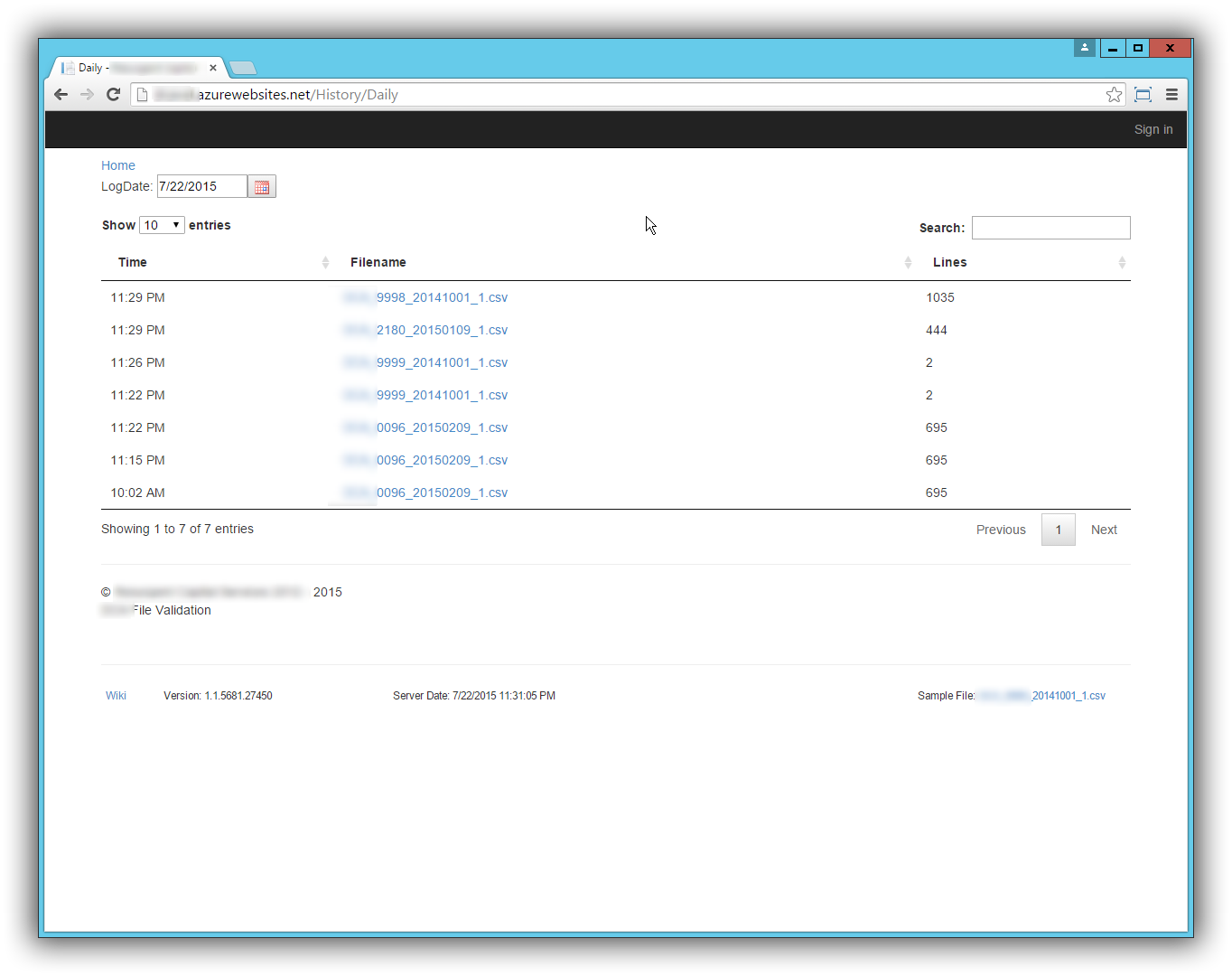
The user can view the history for the last 7 days. This screen had as much value to me as the developer as it did to the user. Before I added this screen, I would get an email saying some file didn’t validate. The email was not very descriptive as to why it didn’t validate and I was left searching log messages to figure out the problem. This screen allowed me to easily see why a file failed validation. I added a date picker to select the day and view the results.
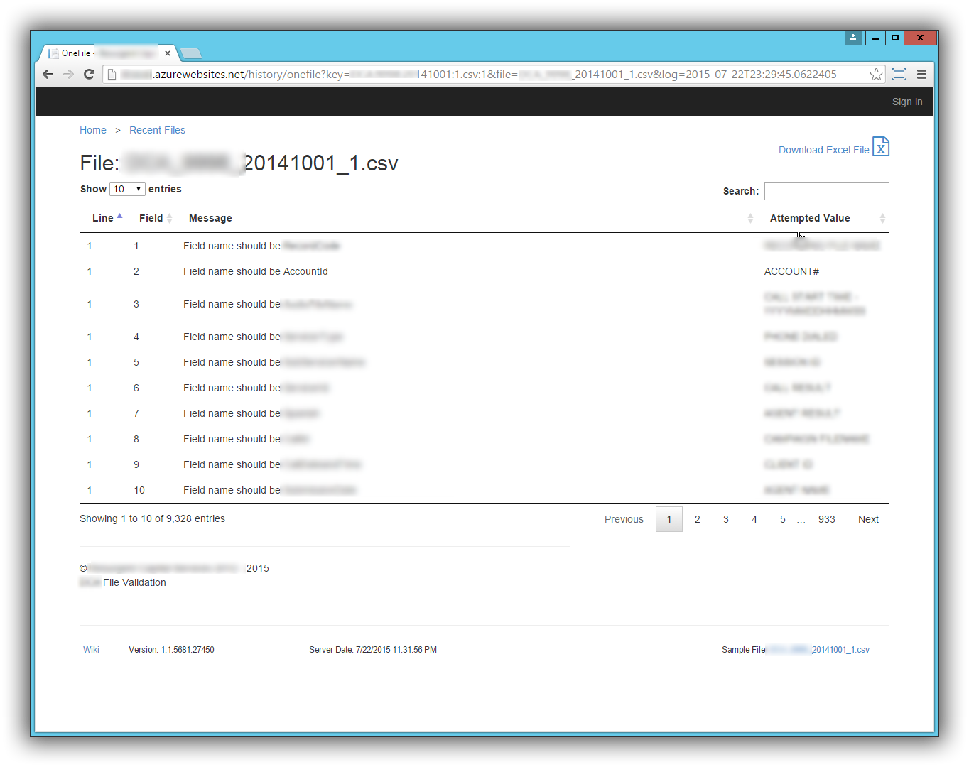
History Detail Screen
Once a file is clicked from the History List Screen, this screen displays the detailed error messages for that file.
Code
Code Coverage
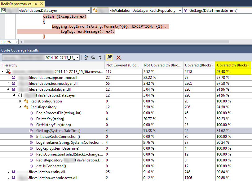
I know how rare it is to get 97% code coverage. I have been on projects where we were happy with 75-80% (and many where we had none). This was really helpful when we needed to do a version 1.1 of this project. I made the required changes, ran my tests. Some of them were broke, as they should have been, based on the new requirements. I fixed those tests and added a few more.
I highlighted the catch block above, since that is the code that is hardest for me to get code coverage on. I know many people would eliminate the try/catch and let it bubble up. That would “fix” the code coverage issue, but I am not really sure that is a fix. In my experience, I like to catch the error as close to where it happened as possible. Often, I can add parameters that were passed to the method in the error handler so I know what value it was working with when the error occurred.
Code Execution Time
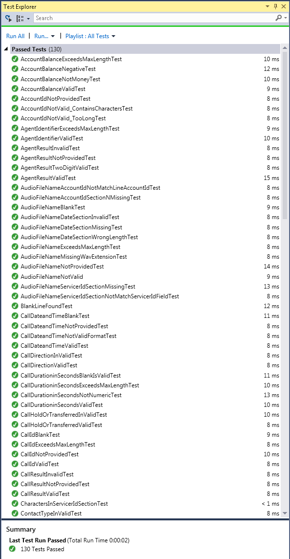
We all agree that our unit tests should be fast so they can be run often. However, this was another one of those rare cases that I don’t see on most projects. It ran all 130 tests in under 2 seconds.
Technology / Tools
- C#
- SignalR
- Redis
- Azure
- FluentValidation
- AngularJS
- DataTables
- DropZone
