-
Using Gemini to troubleshoot engine noise
I have to admit I didn't think of this one my own. A friend from work gave me this idea (thanks JB).
-
Help With Zoning
Looking for help to answer zoning questions.
I had the idea that if Claude had access to prior legal cases, it could be helpful to find cases related to zoning and find out who the lawyer was. This could be a good person to help answer...
-
My AI Journey in February 2026
As I continue this AI journey, I often find links for videos that I want to be able to find more quickly in the future. That is the goal for this post
-
Careful what you search for...
While updating some of the links for the Quotes page, I noticed that my link for "It's a Wonderful Life" was broke. So, I went to youtube to search for a new one.
-
Catio - Thinking in Components
As it was snowing this morning, I was staring out the window at the catio. As a computer programmer, I often think in terms of "How can I build a reusable component?" Looking at the walls—each one an independent 32" section that ties together—I realized I take that component thinking even into my woodworking projects. :-)
-
Connecting M365 Copilot to an On-Premises Knowledge Base Through Azure API Management
Many organizations have internal knowledge bases that employees need to query daily — but those systems live on-premises, behind corporate firewalls. With Microsoft 365 Copilot and Copilot Studio, you can build an AI-powered agent that lets anyone in your organization ask natural language questions against that internal KB — without ever exposing it to the public internet. This post walks through the architecture and steps to make it happen, using Azure API Management as the secure bridge.
-
What is the best way to provide content to Copilot
Claude conversation about how to use existing data in Copilot
-
When management thinks 100 junior devs can do the work of 3 senior devs
I saw this video and just had to share it.
-
Estimates
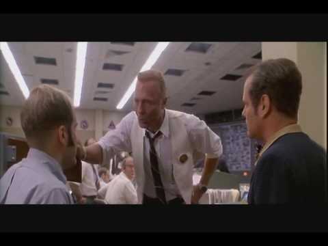
It is one of the harder things to do in software development. I was in a meeting recently where the subject came up. This clip from Apollo 13 where Ed Harris (as Gene Kranz) said "I don't need the whole ... Bible, just give me a couple chapters..." kept running through my head.
-
2019 Videos, Links, & Whatever...
Like a twig on the shoulders of a mighty stream...I have been quoting a variation of the phrase for years, and couldn't remember where it was from. However, the other day, Plains, Trains & Automobiles (1987) was playing and Del Griffith uttered the line.


